
Here's the code for building a carousel.
I implemented it using Joy UI and react-multi-carousel.
Installing Joy UI
You can find Swiper's official documentation here.https://swiperjs.com
yarn add swiperYou can find Joy UI here. This is just my personal opinion, but I prefer Joy UI since it's easier to use than MUI.
↓ Here's the getting-started guide
https://mui.com/joy-ui/getting-started/
yarn add @mui/joy @emotion/react @emotion/styledBuilding a Card Style with Joy UI
The specifics don't really matter, but let's build a card style for now.
Since we're using Joy UI, import whatever components you need.
        {/* Section Member Staff */}
        <Box sx={{ p: 2, maxWidth: '880px', margin: 'auto', my: 10 }}>
          <Box sx={{ mb: 2 }}>
            <Typography level='h2' sx={{mb: 1}}>施術師</Typography>
            <Typography>スタッフ情報をご紹介します。</Typography>
          </Box>
          <Card sx={{ width: 320, maxWidth: '100%', boxShadow: 'lg' }}>
            <CardOverflow>
              <AspectRatio ratio={1 / 1}>
                <img src="/static/images/avatar/1.jpg" alt="Staff" loading='lazy' />
              </AspectRatio>
            </CardOverflow>
            <CardContent>
              <Typography level="body-sm" >代表</Typography>
              <Typography level="title-lg" >スタッフ名</Typography>
              <Typography level='body-sm'>鍼灸師・柔道整復師</Typography>
            </CardContent>
          </Card>
        </Box>
This is roughly how I styled it.
Just one example.
Implementing the Carousel with react-multi-carousel
What Is react-multi-carousel?
It's a component that lets you easily add a carousel to a React project.
- Supports animation
- Supports responsive layouts
These were the parts I particularly liked.
How to Do It
↓ Just follow the documentation below and you're set
https://www.npmjs.com/package/react-multi-carousel
Just import it and wrap your content in <Carousel> and it works right away — simple and nice
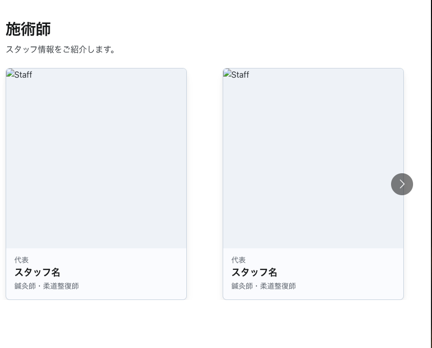
I put together a minimal setup for now, but the page below has plenty of examples, so if you want something richer, it's worth checking out CodeSandbox.
https://codesandbox.io/examples/package/react-multi-carousel
A Quick Walkthrough of How to Use react-multi-carousel
I've noted the option explanations below with comments.
// 必要なライブラリをインポート
import React from 'react';
import CarouselLibrary from 'react-multi-carousel'; // カルーセル用のライブラリ
import 'react-multi-carousel/lib/styles.css'; // カルーセルのスタイルシート

// デバイスごとの表示設定を定義
const deviceSettings = {
  desktop: {
    breakpoint: { max: 3000, min: 1024 }, // デスクトップ用の画面幅の範囲
    items: 3, // 一度に表示するアイテム数
    slidesToSlide: 3, // 一度にスライドするアイテム数
  },
  tablet: {
    breakpoint: { max: 1024, min: 464 }, // タブレット用の画面幅の範囲
    items: 2,
    slidesToSlide: 2,
  },
  mobile: {
    breakpoint: { max: 464, min: 0 }, // モバイル用の画面幅の範囲
    items: 1,
    slidesToSlide: 1,
  },
};

// カルーセルコンポーネントの定義
const GeneralCarousel = () => {
  return (
    // CarouselLibraryコンポーネントを使用
    <CarouselLibrary
      swipeable={false} // スワイプ操作を無効化
      draggable={false} // ドラッグ操作を無効化
      showDots={true} // 下部にページング用のドットを表示
      responsive={deviceSettings} // デバイスごとの設定を適用
      ssr={true} // サーバーサイドレンダリングを有効化
      infinite={true} // 無限スクロールを有効化
      autoPlay={true} // 自動再生を有効化
      autoPlaySpeed={3000} // 自動再生の速度を設定(3秒間隔)
      keyBoardControl={true} // キーボード操作を有効化
      customTransition="all .5" // カスタムの遷移アニメーション(0.5秒)
      transitionDuration={500} // 遷移のアニメーション時間を設定
      containerClass="carousel-container" // カスタムスタイルを適用するためのコンテナクラス
      removeArrowOnDeviceType={["tablet", "mobile"]} // 特定のデバイスで矢印を非表示
      dotListClass="custom-dot-list-style" // ドットのカスタムスタイルクラス
      itemClass="carousel-item-padding-40-px" // アイテムの間隔スタイル
    >
      {/* 表示するアイテムを定義 */}
      <div>Content 1</div>
      <div>Content 2</div>
      <div>Content 3</div>
      <div>Content 4</div>
      <div>Content 5</div>
    </CarouselLibrary>
  );
};

// コンポーネントをエクスポート
export default GeneralCarousel;
If you swap out the div tags in the code above for the card we built earlier, you can get the card working inside the carousel.
Other Components
Swiper
https://swiperjs.com
I tried this one out too.
I felt its strength was how simple it is to get started — just place <SwiperSlide> as a child of <Swiper>.
It also has plenty of demos, so it seems capable of building rich carousels too.
Personally, though, I found the way it handles spacing between columns awkward to work with, so I moved away from it.