
This is a write-up of episode 15 of the podcast, released every Monday. Today's main topic is how we restructured our design guidelines into Markdown, formatted specifically for AI. I cover everything from the underlying philosophy to how we actually put it to use.
Main Topic — Restructuring Design Guidelines for AI

Where Design Guidelines Come From — Paul Rand's Work
What exactly is a design guideline? Trace it back to its roots, and you land on the designer Paul Rand.
Paul Rand is known as the person who established corporate identity (CI) for businesses. His thinking is the origin of the idea that a company's visual expression — not just the logo, but business cards, flyers, truck livery, even how exhibits are arranged in physical space — should all be kept consistent.
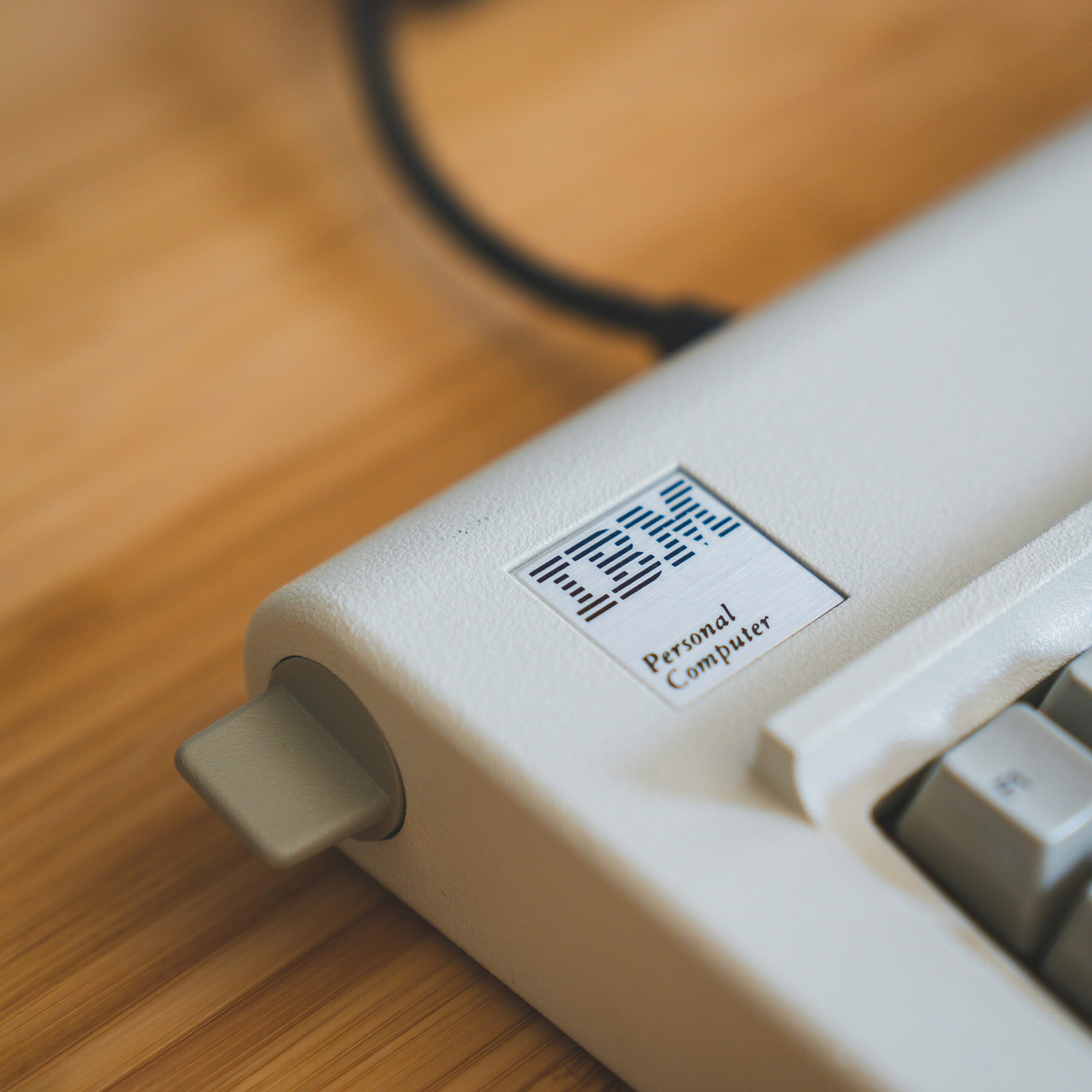
Famous examples include the IBM logo (including the unique version that spells out "IBM" with an eye, a bee, and an M), the ABC logo, and the NeXT Computer logo.
For the NeXT logo, part of a roughly 100-page booklet detailing the color specifications, usage rules, and the experimentation process behind the upper/lowercase treatment is publicly available online. It's said that Steve Jobs saw this booklet and that's what convinced him to move forward with it.
What Actually Goes Into a Design Guideline
A typical design guideline includes content like the following.
- Logo usage — keeping clear space around the logo equal to at least 50% of its height and width, never changing its color arbitrarily, never making it semi-transparent, and so on
- Color palette — specifying the main color, text color, and grays
- Typography — rules for fonts and heading sizes
- Spacing — how to handle whitespace
- Spatial design — rules for layout at trade shows, and similar
I've seen Huawei's design guidelines before, and they even specified layout rules for trade-show booths. Just as Josef Müller-Brockmann discusses in his work on grid systems, design principles carry over not just to flat surfaces, but into 3D space as well.
Rewriting It in "Text Only," for AI
Design guidelines meant for humans are explained visually. But AI (an LLM) isn't especially good at parsing large amounts of image information.
So I figured, why not build the whole thing out of text information from the very start — and wrote the design guidelines as a Markdown file (.md).
- The color palette written out as hexadecimal color codes
- Typography specified one rule at a time — "heading 1 is XXpx," "body text is XXpx"
- Layout rules all spelled out explicitly in prose
The Key Is Telling AI What NOT to Do
AI tends to try too hard. It over-decorates places where a human would naturally hold back. So I set up several explicit prohibitions.
- No borders
- Hover effects only on clickable elements, with scale capped at 1.001x
- No box-shadow except on hover
- Never use box-shadow on non-clickable elements
- No emoji
- Drop center alignment; left alignment is the default
The biggest difference from a guideline written for humans is spelling out these explicit "don'ts." Give an AI a rule, and it follows it faithfully — but if you don't say anything, it will, "with the best of intentions," pile on excessive decoration.
We Also Built "Skeleton Templates" for Landing Pages and Flyers
Another thing we built out was a structural template for landing pages and flyers. AI sometimes ends up with too little information, or fails to understand the natural order in which a person moves through content, so we gave it a skeleton to follow.
- Hero — a large visual plus a headline
- Features — the three key features of the service
- Problem statement — "does this pain point sound familiar?"
- Case studies — real-world usage scenarios
- Onboarding flow — the process from contract to delivery
- FAQ — frequently asked questions
By having the AI reference this skeleton template, it now consistently produces materials with nothing missing.
Real Results
Using this design-guidelines.md, we built the following.
- Unifying the website's design — sections that had ended up inconsistent when built by giving AI ad-hoc instructions were unified by having it reference the guidelines instead
- Landing page production — generating landing pages that follow the guidelines
- Trade-show flyers — producing multiple flyers for the Startup Japan Expo
The results were genuinely good. AI gets you to about 70% finished quality, so humans only need to fix the remaining spots that feel off. That efficiency gain is huge.
By the way, this design-guidelines Markdown file is published on the coiai.net blog. Feel free to copy and use it yourself — take a look.
This Week's News — Gemma 4 and the Future of Local LLMs
Google's local LLM, "Gemma 4," has been released. At around 9GB, it's relatively lightweight.
I actually tried it out, and honestly, local LLMs have gotten close enough in performance to each other lately that it's become hard to feel much of a difference between models in everyday use. Of course they still don't match cloud AI, but local LLMs have started behaving quite similarly to one another.
What's even more notable is the appearance of even lighter "bonsai"-style models, ones that can run even on environments without a particularly strong GPU. In other words, we're heading toward an era where having a local LLM running right on your smartphone is simply normal.
What changes once that becomes reality?
- Reduced latency — no more need to communicate with some massive data center
- Integration with AR glasses — real-time responsiveness becomes possible
- Better privacy — camera and audio data can be processed without ever being handed over to an outside company
- More freedom for IoT devices — once you don't need a Wi-Fi connection, placement is no longer constrained
Not needing a network connection also opens up a lot more freedom in where things can be placed. Personally, I think a future where LLMs run locally is a genuinely good direction for things to head in.
Casual Chat — Tasks vs. Work, and Whether Motivation Matters
The Struggle of Being Buried in Tasks Instead of Doing "Work"
I've been buried in tasks like making posters for the trade show. Posters especially still aren't something I can hand off to AI and get something good, so I've been making them myself, but when there are too many tasks, you can't get to actual "work."
Work is moving something forward. A task is clearing out things you already know need to be done, one at a time. Lately I've had this worry that I'm buried in tasks and not doing anything that feels like real work — but at the same time, I also worry that if I step away from tasks entirely, I'll turn into an executive who's lost touch with what's actually happening on the ground.
Is Motivation Even Necessary?
I've come to think it's better to build your work around things you can keep doing even without motivation.
I love making clothes, but without motivation, my hands just won't move. On the other hand, work like building things on a computer is something I can do even with zero motivation. Push yourself too hard and it becomes hard to sustain, and someone with a lot of motivation isn't necessarily someone who's actually competent. Maybe what actually matters more than maintaining 100% motivation at all times is just being able to keep going, steadily, without much drama.
Closing
coiai Inc. works on web development, XR development, core business system development, and on-premises AI adoption support.
UX design is a particular strength of ours. We go on-site to do UX research, directly observing what work actually looks like in practice, before translating that into design. We're committed to development rooted in what we hear on the ground, so that the system never ends up floating disconnected from reality.
Even for projects other companies turned down, or cases where the quote felt too high, there are sometimes ways to bring the cost down by changing the approach. Consultations and quotes are always free, so please feel free to reach out.