Hi there!
Here's a look at the process I follow when a client commissions a logo design.
For this walkthrough, I made a demo logo as a sample.
For logos used across business cards, promotional items, and the web, I also deliver a full brand guideline document (a Corporate Identity) summarizing all the details.
Overview of the Process
Here's the general flow. The number of proposals and revision rounds varies depending on the budget.
- Client interview
- Rough sketches
- Draft cleanup
- Review meeting
- Revisions (the number of rounds depends on the budget)
- Final adjustments
- Delivery of logo variations for different media
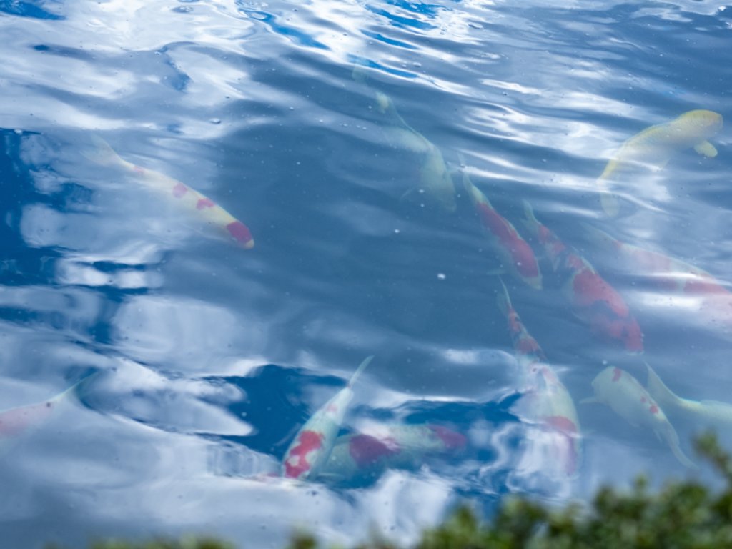
1. Gathering Inspiration
This time, I started from wordplay around my business name, coiai.
Deep indigo, koi (carp), koi (love), ai (affection)
I gather symbols, color associations, and other imagery tied to words like these — or, for a company, imagery drawn from its philosophy.
At this stage I dig through books and the internet, exploring not just the core subject but everything loosely connected to it.
2. Sketching
I do rough sketches on paper based on the imagery I've gathered.
This time I decided to build the mark around a koi pattern, so I worked on abstracting it down to features that would hold up well as a symbol.
3. Digitizing on the Computer
I use Illustrator to turn the sketch into vector art.
I also work out the colors and typography to match the symbol.
At this stage I check in with the client, and once everything looks good, I move on to the next step.
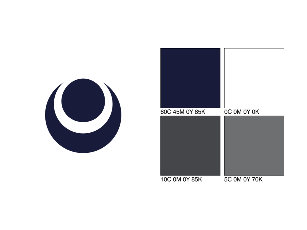
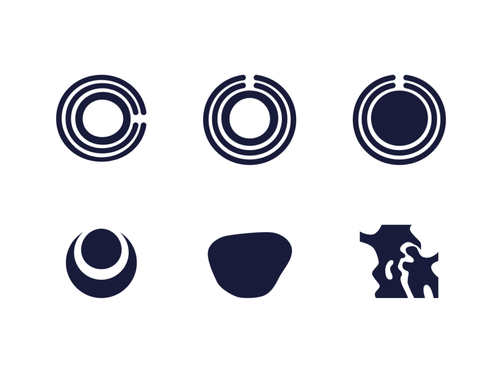
For coiai, the wordplay on "koi eye" led me to base the mark on how carp eyes were drawn in Utagawa Hiroshige's ukiyo-e prints.
I also turned a few other ideas inspired by koi patterns and eyes into vector art.
I also use tools like Google Lens at this stage to check whether the design overlaps with existing marks from other companies.
In this case, the resulting logo ended up resembling a family-crest motif called "makai ni tsuki ni hoshi" (a star facing the moon), but since the proportions differed and it wasn't in trademark use, I went ahead with this design.
Considering Robustness Across Use Cases
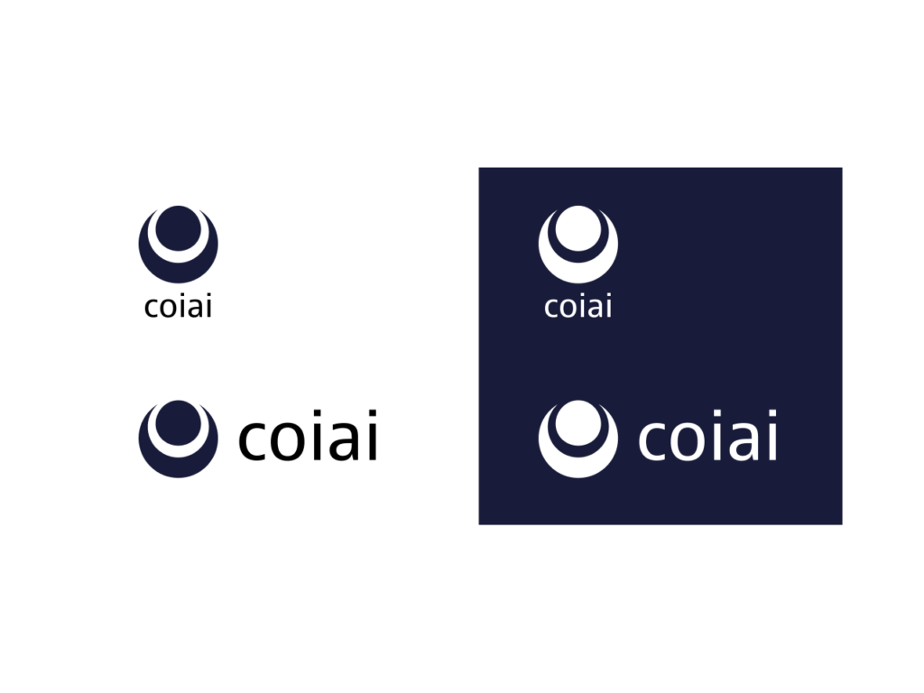
- A pattern for low-brightness backgrounds
- A black-and-white print pattern
- A pattern for fitting into a square, for social media
- Patterns for combining with typography
- Color patterns for print and web
- Making sure it holds up on signage
- A solid-color variation for when gradients are used
- Variations for logo animation
I design with real-world use cases like these in mind, so the logo stays robust and doesn't fall apart wherever the client ends up using it.
Typeface Selection
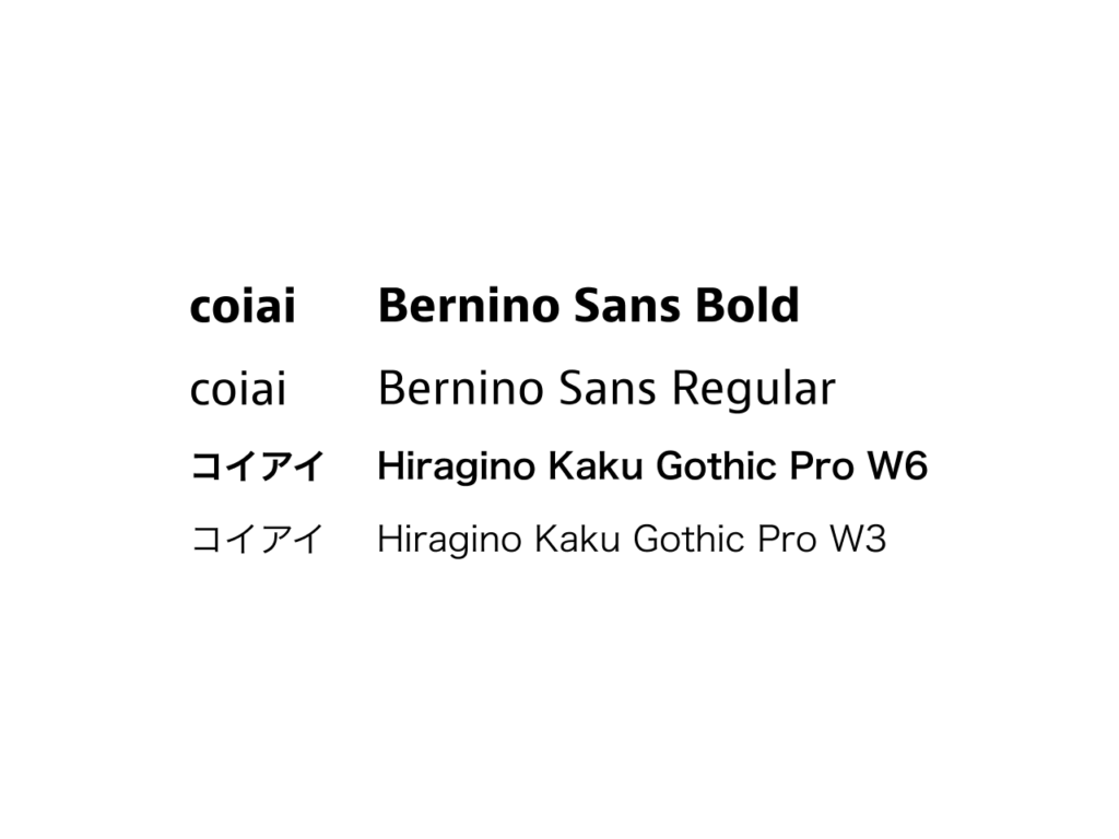
I choose separate typefaces for Latin and Japanese text, each suited to the project. I look into when a typeface was designed, by whom, in what country, and for what purpose, to find the best fit for the case at hand.
For this project, I selected typefaces to use in brochures and on the web. Since the goal was an overall neutral design, I set JAF Bernina Sans, from Just Another Foundry, as the Latin typeface.
It works well both as a headline face and in body text, and its family of variants — including condensed styles — made it easy to work with.
For the Japanese typeface, I set Hiragino Kaku Gothic, which is highly readable in body text.
Reference: https://justanotherfoundry.com/bernini-sans
Color
When multiple colors are involved, I design around color harmony.
I choose colors that stay easy to work with when used on buttons, titles, and similar elements, and I define the exact RGB and CMYK values as well.
This time, the palette is built around a traditional Japanese color called noai (deep indigo).
4. Fine-Tuning
I optimize small details such as optical illusions, the golden ratio, and how corners are handled.
5. A Little Extra
Paul Rand, working on IBM, made a poster built on wordplay with the letters "IBM" — "eye bee M" — representing them with an eye and a bee.
IBM reference: https://www.ibm.com/design/language/ibm-logos/rebus/
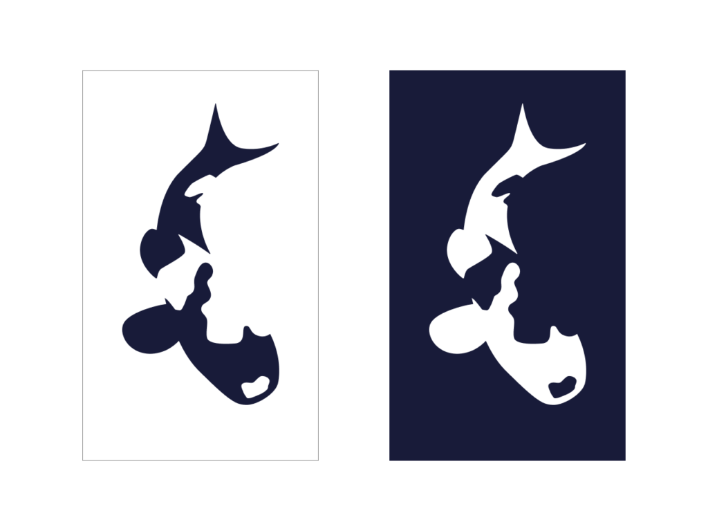
Since the symbol I designed this time ended up quite abstract, I also made a playful indigo koi symbol as an extra piece of design.